Color grading is a powerful tool that transforms ordinary photos into stunning, emotion-driven visuals. Whether you’re an aspiring photographer or a seasoned editor, understanding how to manipulate hue, saturation, and luminance (HSL) can take your images to the next level.
In this guide, we’ll break down everything you need to know about Lightroom’s color grading tool—from its history to practical applications. You’ll learn how to fine-tune shadows, midtones, and highlights, explore different color harmonies, and discover techniques to create mood and depth in your photos.
This image is a still from the 2025 movie Nosferatu. Here we can see the color grading of the highlights on the left starting with a light blue. In the shadows we have a dark navy blue. The midtones are also a lighter navy blue.
How to use color grading tool in lightroom
What is the color grading tool in lightroom and how can you use it do edit your photographs?
The highlights, shadows and midtones can all be adjusted to change for a certain color.
What is the history of the Color grading tool?
Back in the darkroom days, color grading was used for either toning photos. This was a unique way to physically edit your photographs
How does the tool work?


Looking at the color grading menu you will see the adjust directly below the title color grading. You will then see several circular icons.
The first option will allow you to see the entire process of the highlight, shadow and mid tone at the same time.
The second option is solely for the shadows. The dark parts of the image The third option is solely for the midtones of the image. The fourth option is for the brightest part of the image. The final option is a global option for the entire image.
Global Control allows for fast changes in the entire tone of the image with luminance as well. It is also worth noting that blending and balance don’t affect the toning.
Hue, Saturation, and Luminance (HSL)
Sponsored Content
The Next Few Options include the HSL sliders, which are commonly used for color adjustments. HSL stands for:
- Hue: Represents how much unique colored light is present. It allows you to shift one color to another. Moving the slider to the right rotates the hue selector around the color wheel, which has a maximum value of 360.
- Saturation: Represents the intensity and purity of a color. Increasing saturation makes colors more vivid, while decreasing it introduces more neutral tones.
- Luminance: Controls the brightness of colors. Sliding it to the left darkens the midtones, shadows, or highlights, while moving it to the right brightens them.
The Last Few Options

You will notice two additional options that may not be familiar: Blending and Balance.
- Blending: Defines how much the different tonal ranges (shadows, midtones, and highlights) blend together. More blending creates smoother color transitions.
- Balance: Adjusts the weight of highlights and shadows, letting you prioritize which tones dominate the image.
When the blending value is set to 0, there is minimal tonal overlap. At 100, all tones blend seamlessly.

How do you approach color grading?

Now that you understand the basics of color grading, how do you effectively apply it? What resources can help you achieve your desired look? How can you make color grading in Lightroom stand out?
Understanding Color Theory
One of the key foundations of color grading is color theory. Color theory explores how humans perceive colors and how different hues interact to create visually appealing images.
Color Harmonies
Color harmonies are essential in achieving a cohesive and aesthetically pleasing color grade. The image above, featuring Batman and Catwoman, is an example of a monochromatic color scheme. The colors in this scene were carefully selected using Adobe Color Wheel to enhance the overall mood and tone.
Below, we’ll explore different types of color harmonies, including:
- Analogous
- Monochromatic
- Triad
- Complementary
Analogous Color Harmony
Analogous (Greek: Proportional) color harmony consists of three neighboring colors on the color wheel. These colors typically share a similar temperature, either warm (reds, oranges, yellows) or cool (blues, violets, greens).
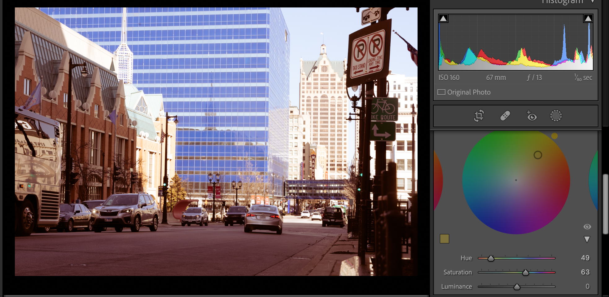
In the image below, the shadows were adjusted to an orange hue with moderate saturation, while the midtones were also shifted toward orange. This creates a warm and inviting atmosphere.

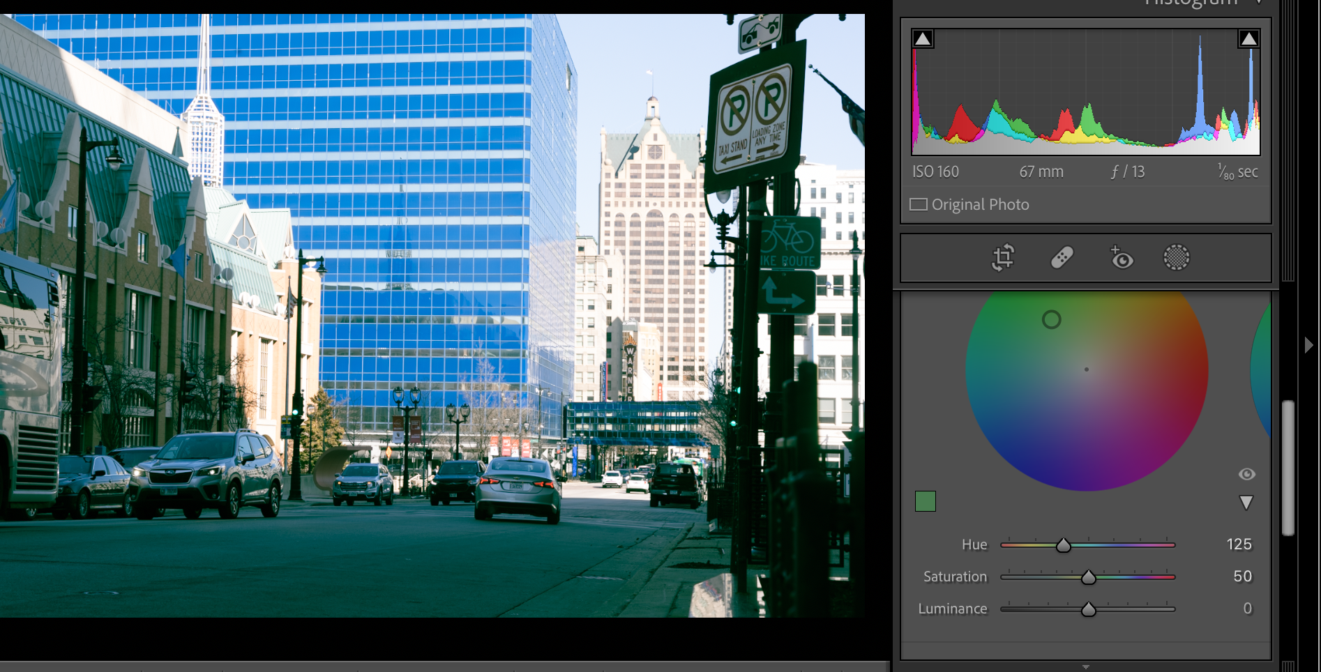
In contrast, the second example applies a cooler color scheme. Here, the shadows were changed to a deep blue, while the highlights were set to a lighter blue. This blending technique helps create a more natural transition between tones.
Why use Analogous Colors?
- They create a richer look compared to monochromatic schemes.
- They provide a smoother visual transition between colors.
- However, they lack strong color contrast, making them less dynamic.

Monochromatic Color Harmony

Monochromatic (Greek: monokhrōmatos – "of one color") color schemes use different shades, tints, and saturations of a single hue.
For example, a red monochromatic scheme may feature deep reds, soft pinks, and muted maroons. This approach can also be applied using neutral colors like black, white, and gray.
Pros & Cons of Monochromatic Color Grading:
- Creates a unified and harmonious look.
- Works well for mood-driven storytelling.
- Lacks strong contrast and vibrance, making it more subtle.

Triad Colors
[Greek treis meaning three, also used in Chinese from San Ho Hui (three unite society)] - Uses three colors that are spaced out across the color wheel.
The triad color scheme is great to show contrast and also maintain balance. Complementary Colors - Made using two colors that are opposite of each other on the color wheel. How I like to remember it is the first 3 colors in the rainbow matched with the next 3. Red, Orange, Yellow and Green, Blue, Purple. The color scheme allows for high contrast tonal changes on the color scheme.
This scheme may be harder to balance especially with contrasting colors. It is best to be aware of desaturated warm colors. It may also be worth looking into split complementary scheme.
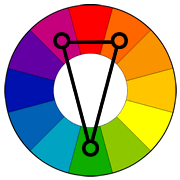
Split Complementary Color scheme
The Split complementary scheme hangs with the complementary scheme. The one difference is that the color scheme splits off for one of the colors to involve a broader range of colors. This reduces the amount of absolute contrast between the opposing colors.
It take a good range and allows the perception of averaging to a less intense color.
Adding it in lightroom
